
18 High Accuracy Chart Patterns
Bullish Chart Patterns
1. Bullish Flag Chart Pattern
A technical continuation pattern known as a bullish flag indicates that a stock or asset is likely to continue its upward trend after a brief consolidation or pause.
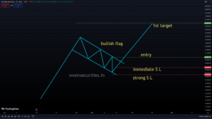
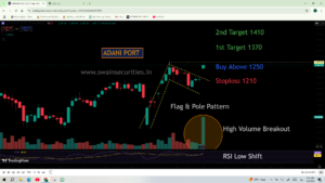
Bullish flag example
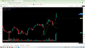
Bullish Flag Result
Anatomy of a Bull Flag
For a pattern to be considered a true bullish flag, it needs three distinct components:
The Flagpole: This is a strong, near-vertical surge in price backed by heavy trading volume. This initial rally establishes the upward trend.
The Flag (Consolidation): Following the surge, the price enters a tight, downward-sloping (or sometimes perfectly horizontal) channel. This forms the “flag.” Crucially, trading volume should decrease during this period, showing that selling pressure is weak and early buyers are simply taking profits rather than panic-selling.
The Breakout: The pattern completes when the price breaks above the upper trendline of the flag, usually accompanied by a surge in volume, signaling the continuation of the original upward trend.
The mentality that drives the pattern Early investors naturally want to lock in some of their profits when an asset experiences a massive rally (the flagpole). As they sell, the price drifts slightly lower, forming the flag.
However, other investors who missed the initial rally are waiting for a “dip” to buy in because the initial move was so strong. These new buyers step in after the profit-seekers’ selling pressure subsides, overwhelming the remaining sellers and propelling the price to new highs. How It Is Commonly Sold The bull flag is used by traders to plan precise entries and control risk:
Entry:
Typically, traders wait for confirmation before buying when a candle closes above the flag’s upper resistance line.
Stop Loss:
To manage risk in case the pattern fails (a “false breakout”), a stop loss is typically placed just below the lowest point of the flag consolidation.
Profit Target:
The most common method for setting a goal is to measure the length of the first flagpole and project that distance up from the breakout point.
2. Bullish Pennant Pattern
Like a bullish flag, a bullish pennant is a technical continuation pattern that signals a brief pause in a strong uptrend before the asset breaks out to new highs.
The psychology is similar to that of a flag in that early buyers are taking a break and locking in profits, but the consolidation phase takes a different shape.
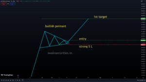
bullish pennant
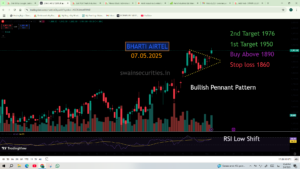
pennant example
How a Bullish Pennant Works Three distinct components are required for a genuine bullish pennant: The Flagpole: A sudden, huge price rise supported by a lot of trading. The Pennant (Consolidation): The price enters a tight consolidation phase following the initial surge. A pennant, in contrast to a flag, which forms a parallel channel, is a small symmetrical triangle. The highs get lower and the lows get higher, meaning the upper and lower trendlines converge toward a point. During this “squeeze,” volume should significantly decrease, which is crucial. The Breakout: The pattern ends when the price breaks above the upper descending trendline of the triangle. Typically, this occurs with a surge in volume, which indicates that the upward trend has resumed. How It Is Commonly Sold The bullish pennant is used by traders to time their entry points into an ongoing trend:
Entry:
Traders typically wait for confirmation before buying when the price breaks above the pennant’s upper resistance line.
Stop Loss:
A stop loss is usually placed just below the lowest point of the pennant’s triangle to prevent a false breakout.
Profit Target:
Traders measure the height of the initial flagpole and project that exact same distance upward from the breakout point to estimate where the next rally might end.
3. Double Bottom Chart Pattern
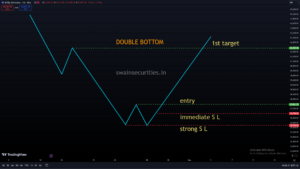
Double bottom pattern
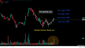
double bottom example
The double bottom is the exact inverse of the double top. At the conclusion of an extended downtrend, it is a significant bullish reversal pattern. It looks like the letter “W” and tells you that the selling pressure is over and that a new upward trend is probably starting. The Structure of the Pattern A legitimate double bottom develops through four distinct phases: First Trough: The asset makes a new low and is in a strong downtrend. At this level, buyers step in to scoop up a perceived bargain, causing a temporary bounce in price.
The Peak (Neckline): The price rallies to a localized resistance level before the buyers run out of steam. This temporary high establishes the “neckline” for the pattern.
Second Trough: Sellers attempt to resume the original downtrend and push the price back down. However, at roughly the same price point as the First Trough, they encountered a substantial block of buyers. A second rejection is made of the price. The Breakout: The pattern is complete when the price breaks aggressively above the neckline resistance that was established during the peak after rising from the second trough.
The Psychology Behind the Reversal
A double bottom illustrates a critical shift in market momentum and seller exhaustion.
Early buyers enter the market when the price reaches the First Trough, but the overall market is still bearish. When sellers attempt to drive the price to a new low (the Second Trough) and fail, a psychological shift occurs.
This double defense of a support level demoralizes the sellers. Short-sellers begin to buy back their positions to secure profits as the asset continues to decline, and new buyers flood the market, convinced that the bottom has been reached. Once the price breaks above the neckline, the remaining bears are forced out, accelerating the new uptrend.
How It Is Commonly Sold Traders use the double bottom to exit short positions and enter long (buy) positions:
Entry: Traders wait for confirmation before entering a long position when the price breaks above the neckline and closes above it. It is risky to buy early—while the second trough is still forming—because the support could break and the downtrend will continue.
Stop Loss: A stop loss is typically placed just below the support line connecting the two troughs. The bullish reversal has failed if the price falls below this level. Traders measure the vertical depth from the neckline to the troughs for their profit target. To set a primary profit target, they then project that exact distance upward from the breakout point.
4. Tripple Bottom Chart Pattern
A triple bottom is a bullish reversal chart pattern used in technical analysis. It typically forms at the end of a prolonged downtrend and signals a shift in market psychology — sellers are exhausted, and buyers are taking control.As the name implies, the pattern consists of three consecutive downward moves (troughs) that bounce off the same support floor, followed by a final upward surge.
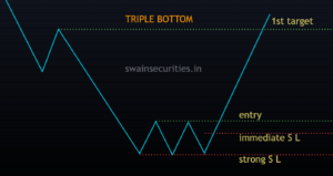
Triple bottom chart pattern
Key insight:
The defining feature of a valid triple bottom isn’t just the three lows — it’s the breakout above the resistance line. Until the price breaks the “neckline,” it is just a sideways trading range.
How to Identify the Pattern
Technical analysts look for the following specific characteristics to confirm a triple bottom: Prior Downtrend: The pattern must be preceded by a clear, established downward move. Without a prior downtrend, there is nothing to reverse.
Three Bottoms: The price hits a specific floor (support) three distinct times, failing to break lower each time. The lows don’t have to be to the exact penny, but they should sit at roughly the same price level.
The Neckline (Resistance): The peaks that form between the three bottoms create a horizontal “neckline.” This acts as a ceiling that the price must break through to confirm the reversal.
Volume:
Volume generally tapers off as the pattern develops (indicating selling pressure is drying up) and then surges dramatically when the price finally breaks above the neckline.
What Traders Do With It When setting up a trade based on a triple bottom, traders typically rely on standard technical rules for entry, risk management, and profit-taking.
Entry Strategy:
Most traders wait for a decisive breakout — usually a full candle closing above the neckline — rather than trying to buy early at the third bottom. This prevents getting trapped in a descending channel if the support ultimately fails.
Price Target:
The profit target is usually calculated by measuring the vertical height of the pattern (the distance from the support line to the neckline) and projecting that exact distance upward from the breakout point. (For example, if support is at $100 and resistance is at $120, the target is $140).
Stop-Loss:
To manage risk in case of a “fakeout” (a false breakout), a stop-loss is often placed either just beneath the newly broken neckline or safely below the support level of the three bottoms.
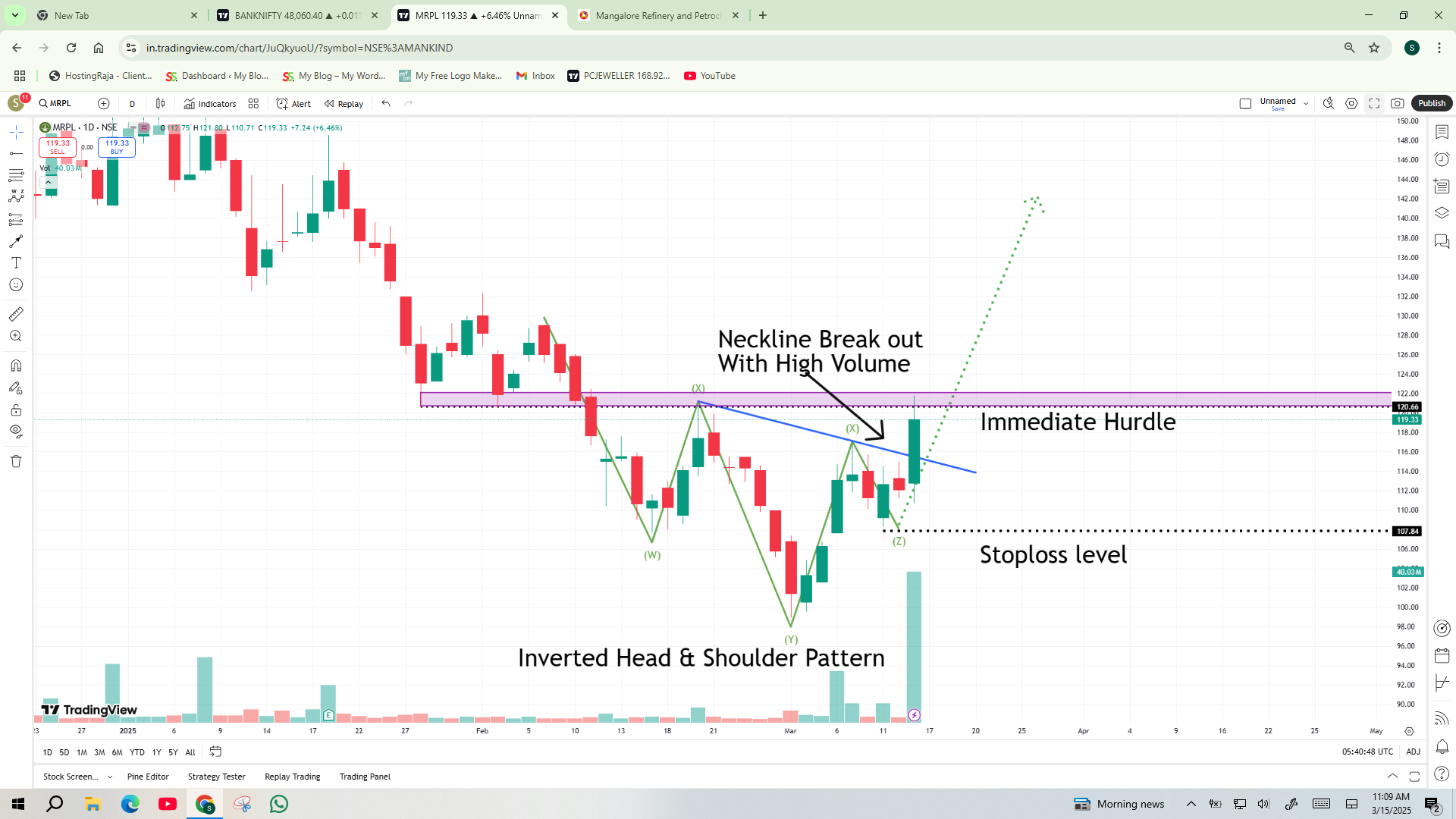
5. Inverted Head and Shoulder
In technical analysis, a bullish reversal pattern is an inverted head and shoulders, also known as an inverse head and shoulders. It appears at the bottom of an extended downtrend and signals that sellers are losing momentum, suggesting an asset’s price is preparing to reverse and rally upward.
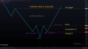
inverted head and shoulder
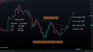
Inverted head and shoulder example
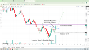
Anatomy of the Pattern
The pattern is formed by three consecutive troughs (lows) separated by temporary rallies.
Left Shoulder: The price drops to a new low in the current downtrend, then bounces upward as buyers briefly step in.
Head: The price drops again, breaking past the low of the left shoulder to form the deepest point of the pattern. It then rallies a second time.
Right Shoulder: The price goes down a third time, but the sellers can’t get it as low as the head any more. This trough bottoms out roughly around the same level as the left shoulder, followed by a final rally.
The Neckline: This is the line of resistance drawn by connecting the peak (highs) of the two rallies that occurred between the shoulders and the head. The neckline can be horizontal, or sloped slightly up or down.
How It Is Traded
This pattern is used by technical traders to plan specific entry and exit points. The Entry: A trade is traditionally triggered when the price breaks decisively above the neckline after forming the right shoulder.
The Price Target: To estimate how far the price might run, traders measure the vertical distance from the bottom of the head to the neckline. They then project that exact distance upward from the breakout point on the neckline.
The Stop Loss: To protect against a false breakout (where the price briefly crosses the neckline and then crashes), traders typically place a stop-loss order just below the bottom of the right shoulder.
The Role of Volume
Volume is a critical confirmation tool for this pattern. Ideally, trading volume should:
Be highest during the decline into the left shoulder or the head.
Start to dry up (decrease) as the right shoulder forms, showing that selling pressure has exhausted itself.
Spike significantly when the price breaks above the neckline, confirming that strong buying demand is driving the reversal.
6. Ascending Triangle Pattern
An ascending triangle is a widely followed chart pattern in technical analysis. It is generally considered a bullish continuation pattern, meaning it usually forms during an existing uptrend and suggests that the price will eventually break out higher and continue its upward climb.
Sometimes, it can also appear at the end of a downtrend, where it acts as a reversal pattern indicating a shift in momentum from sellers to buyers.
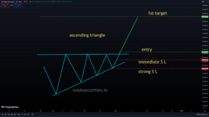
ascending triangle chart pattern
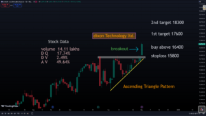
Ascending triangle example
Anatomy of the Pattern
The ascending triangle is formed by price action consolidating between two converging trendlines:
The Upper Resistance Line: This is a horizontal (flat) line drawn across the top of the pattern, connecting at least two roughly equal peak highs. This level represents a zone where sellers consistently step in to push the price down.
The Lower Support Line: This is an upward-sloping line drawn along the bottom, connecting a series of progressively higher lows. This rising line shows that buyers are becoming more aggressive, stepping in to buy at higher and higher prices each time the asset dips.
The trading range gets tighter and tighter as the price moves between the rising bottom and the flat top. This builds pressure, which typically resolves in a breakout.
How It Is Traded
Technical traders use the structure of the ascending triangle to set up potential trades, looking to capitalize on the expected breakout.
The Entry: Traders usually wait for the price to break decisively above the flat resistance line. Entering early (before the breakout) is risky, as the price could fail to break resistance and fall instead.
The Price Target: To estimate the potential profit target, traders measure the vertical distance from the lowest point of the triangle (the start of the rising trendline) to the flat resistance line. They then project that exact distance upward from the point of the breakout.
The Stop Loss: To protect capital if the breakout fails (a “fakeout”), a stop-loss is often placed just below the most recent swing low within the triangle, or slightly below the breakout line.
The Role of Volume
Just like with the inverted head and shoulders, trading volume provides crucial context:
During Formation: Volume typically shrinks as the price consolidates and the triangle gets narrower.
On Breakout: Ideally, a volume spike should accompany a legitimate breakout above horizontal resistance. High volume confirms that there is strong buying interest driving the move. It is more likely that a breakout on low volume will fail.
7. Bullish Falling Wedge
A bullish falling wedge is a technical chart pattern that signals a potential upward move in price. While the pattern is being formed, the price is making lower highs and lower lows, which is considered a bullish signal because it indicates that selling momentum is slowing down and a breakout to the upside is likely. It can act as either a continuation pattern (when it forms during a larger uptrend as a brief period of consolidation) or a reversal pattern (when it forms at the very bottom of a prolonged downtrend). In both cases, the expected resolution is a breakout to the upside.
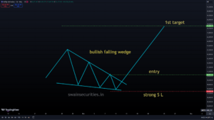
bullisg falling wedge
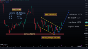
Falling Wedge example
The Structure of the Pattern.
The falling wedge is defined by two converging trendlines that slant downward:
The Upper Resistance Line: Drawn across a series of lower highs. This line shows that sellers are still pushing the price down, but the slope is steep.
The Lower Support Line: Drawn across a series of lower lows. Crucially, this line is flatter (less steep) than the upper resistance line. This demonstrates that sellers are having difficulty lowering the price as aggressively as before, despite the fact that the price is still falling. Because the upper line is steeper than the lower line, the two lines eventually converge, creating a narrowing “wedge” shape. This narrowing range creates pressure, which usually leads to a bullish breakout.
How It Is Traded
Technical traders use the falling wedge to anticipate when the buying pressure will finally overcome the selling pressure.
The Entry: Traders typically wait for a decisive breakout above the upper resistance line. Waiting for a daily candle to close above this line to confirm that the breakout is not a fakeout is a common strategy. The Price Target: To estimate the potential move, traders measure the vertical distance of the widest part of the wedge (at the beginning of the pattern). They then project that distance upward from the point where the price breaks out of the resistance line.
The Stop Loss: A stop-loss is typically placed just below the most recent swing low within the wedge, or safely below the lower support trendline, to protect against a failed breakout.
The Role of Volume
Volume provides critical confirmation for a falling wedge:
During Formation: Trading volume should gradually decrease as the wedge narrows and the price consolidates. This shrinking volume confirms that the selling pressure is exhausting itself.
On Breakout: A valid, high-conviction breakout above the upper resistance line should be accompanied by a surge in volume. If the price breaks out on low volume, it is much more likely to fail and pull back into the wedge.
8. Symmetrical Triangle Pattern
A symmetrical triangle is a chart pattern characterized by a period of price consolidation before an inevitable breakout. A symmetrical triangle, in contrast to ascending or descending triangles, which have a clear bias in one direction, symbolizes a time of uncertainty in the market when buyers and sellers are in equilibrium. It is most commonly treated as a continuation pattern, meaning the price will usually break out in the direction of the trend that existed before the triangle formed. However, because it represents neutrality, traders must be prepared for a breakout in either direction.
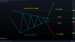
symmetrical triangle pattern
Anatomy of the Pattern
A symmetrical triangle is formed by two converging, symmetrically sloped trendlines:
Drawn across at least two lower highs is the Descending Resistance Line. This shows that sellers are willing to sell at progressively lower prices.
The Ascending Support Line: Drawn across at least two higher lows. This demonstrates that buyers are entering the market at ever-increasing prices. As these two lines slope toward each other, the price bounces between them in an increasingly tight range (resembling a funnel or a pennant). As the market coils up, waiting for a catalyst to break the deadlock, this suggests a decrease in volatility.
How It Is Traded
Because the direction of the breakout is not guaranteed, traders use a reactive approach rather than guessing the move ahead of time.
The Entry: Traders wait for a clean, definitive daily or hourly candle to close outside one of the trendlines.
Bullish entry: Enter a long position if the price breaks above the upper resistance line.
Bearish entry: Enter a short position if the price breaks below the lower support line.
The Price Target: To establish a profit target, measure the vertical distance of the widest part of the triangle (the base, where the two trendlines begin). Add or subtract that exact distance from the specific point where the breakout occurred.
The Stop Loss: To protect against a false breakout, a stop-loss order is typically placed just inside the triangle, on the opposite side of the breakout line (e.g., below the most recent minor swing low for an upside breakout).
The Role of Volume
Volume behaves much like it does in other wedge and triangle patterns, serving as a critical verification mechanism:
During Formation: As the pattern moves closer to the triangle’s apex, the volume gradually decreases. This signifies that the market is waiting on the sidelines for a definitive direction.
On Breakout: A valid breakout must demonstrate a distinct volume explosion. A sharp rise in volume indicates strong institutional participation and conviction behind the direction of the move. If the price slips out of the triangle on flat or low volume, it should be treated with heavy skepticism.
9. Bullish Expanding Triangle
A unique and highly volatile chart pattern is the bullish expanding triangle, which is also known as a broadening formation, megaphone pattern, or inverse triangle in technical analysis. Unlike standard triangles where the price compresses and volatility shrinks, an expanding triangle shows the exact opposite: volatility is accelerating. The price swings become progressively wider, creating a pattern that looks like a megaphone. When it breaks out to the upside, it acts as a powerful bullish signal.
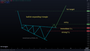
Bullish Expanding Triangle
Anatomy of the Pattern
The expanding triangle is defined by two diverging (separating) trendlines:
The Ascending Resistance Line: Drawn across a series of progressively higher highs.
The Descending Support Line: Drawn across a series of progressively lower lows.
This pattern represents a highly emotional market where buyers and sellers are engaged in a fierce tug-of-war. Buyers are aggressive enough to push the price to new local highs, but sellers are equally aggressive, forcing the price down to new local lows on the pullbacks.
How It Is Exchanged Expanding triangles are notoriously difficult to trade within the pattern due to the large price swings. Most conservative traders wait strictly for the breakout.
The Entry: A long trade is triggered when the price breaks decisively above the upper resistance line, ideally with a strong candlestick close outside the pattern.
The Price Target: To determine a profit target, traders measure the vertical distance between the highest high and the lowest low at the widest part of the triangle. This full height is then projected upward from the breakout point.
The Stop Loss: Because the swings are so wide, placing a stop loss at the absolute bottom of the pattern is usually too risky. Instead, traders typically place the stop loss just below the most recent partial decline or swing low within the pattern.
The Role of Volume
Volume behaves differently in an expanding triangle compared to standard, converging triangles:
During Formation: Instead of drying up, volume in an expanding triangle often remains high or increases alongside the expanding price swings. This confirms growing market chaos and heavy participation from both sides.
On Breakout: Just like other bullish patterns, the final breakout above the upper resistance line requires a significant surge in volume to prove that buyers have officially won the battle and are ready to drive the trend higher.
10. Symmetrical Expanding Triangle
Market instability is the hallmark of a pattern known as a symmetrical expanding triangle, also known as a megaphone top/bottom or symmetrical broadening formation. Unlike standard symmetrical triangles where the price action coils tightly into an apex, an expanding triangle features price swings that grow wider over time. It represents a market that is losing its directional anchor due to its symmetrical expansion, with buyers and sellers acting erratically. It is considered a bilateral pattern, meaning it is neutral until a breakout occurs—the price can break out aggressively to either the upside or the downside.
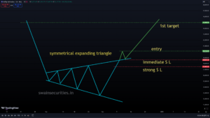
symmetrical expanding triangle
Anatomy of the Pattern
The symmetrical expanding triangle is drawn using two diverging trendlines that open up at roughly equal angles:
Drawn across a series of progressively lower lows, the ascending support line The Ascending Resistance Line: Drawn across a series of progressively higher highs.
This pattern usually features at least three higher peaks and three lower troughs. It indicates a highly emotional setting. Buyers repeatedly push the price to new highs, believing a breakout is underway, only for sellers to completely hijack momentum and drag the price to new lows. This vicious cycle repeats, causing the megaphone structure to widen.
How It Is Exchanged Because the trading range is expanding rather than compressing, trading inside the structure can result in getting chopped up by false moves. Most experienced traders handle this pattern reactively.
The Entry: Wait for a decisive, high-volume candle to close outside one of the trendlines.
Bullish Entry: Go long if the price breaks and closes above the upper ascending resistance line.
Bearish Entry: Go short if the price breaks and closes below the lower descending support line.
The Price Target: Measure the vertical distance between the highest peak and lowest trough at the widest part of the megaphone. Project that exact distance from the breakout point in the direction of the break.
The Stop Loss: Due to the massive swings, placing a stop loss on the completely opposite side of the megaphone is mathematically unfeasible for proper risk management. Instead, traders place their stop loss right back inside the broken trendline or just beyond the most recent swing high or low within the pattern.
The Role of Volume
An expanding triangle’s volume trends are in opposition to those of standard triangles: During Formation: Volume often increases or remains erratically high as the pattern develops. This confirms the chaotic, emotional tug-of-war taking place between bulls and bears.
On Breakout: A genuine breakout necessitates a sizable, unmistakable volume surge. Because this pattern represents a state of market confusion, it takes an immense amount of institutional volume to definitively prove that one side has permanently won the battle.
Caution: Symmetrical expanding triangles are historically prone to “partial declines” or “partial rises,” where the price fails to journey all the way to the opposite trendline before abruptly reversing and breaking out early. Always practice strict risk management when trading megaphone structures.
Bearish Chart Patterns
11. Head and Shoulder Pattern
Unlike flags and pennants, the head and shoulders is a major trend reversal pattern. It is thought to be one of the most reliable indicators that a bearish downtrend is about to begin when it forms at the top of an extended uptrend.
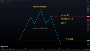
Head and Shoulder
Anatomy of the Pattern
The pattern visually resembles a head with two shoulders and rests on a support line called the “neckline.” It has four distinct components:
Left Shoulder: The price goes up to a high point and then goes down. This appears to be a typical downtrend pullback. Head: The price rises again, pushing past the peak of the left shoulder to form a new, higher high. Then, it goes back down, about where the first pullback’s support level was. Right Shoulder: The price rises once more, but buyers are losing interest. This third rally has a peak that is lower than the head, which frequently corresponds to the height of the left shoulder. The price then falls again.
The Neckline: This is the support line drawn by connecting the low points (the “troughs”) between the shoulders and the head. The neckline can be completely horizontal or slightly sloping up or down. The Psychology That Drives the Turnaround A head and shoulders pattern is a visual representation of a power shift from buyers to sellers:
During the Left Shoulder & Head: Buyers are still in control, pushing the asset to new highs.
During the Right Shoulder: The narrative shifts. Buyers try to push the price to a new high but fail, resulting in a “lower high.” This is the first major red flag that the uptrend is exhausted.
The Neckline Break: When the price falls below the neckline, the remaining buyers throw in the towel, and sellers take full control. The drop is frequently accelerated by panic selling or stop-loss strategies.
How It Is Typically Traded
Because this is a bearish reversal pattern, traders use it to close out “long” (buy) positions or to initiate “short” (sell) positions:
Entry: Until the price breaks below the neckline, the pattern is not confirmed. Traders typically enter a short position when a candle closes below this line.
Stop Loss: A stop loss is usually placed just above the peak of the right shoulder. If the price rallies back above that point, the reversal has failed.
Profit Target: Traders measure the vertical distance from the peak of the Head straight down to the Neckline. They then project that exact distance downward from the breakout point to set a primary profit target.
12. Double Top Pattern
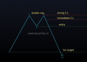
double top
A common and highly effective bearish reversal pattern is the double top. It signifies that an asset has repeatedly failed to break through a strong resistance level, indicating that a downward reversal is likely imminent. It occurs at the climax of an uptrend and visually resembles the letter “M.” The Structure of the Pattern Over the course of four distinct phases, a valid double top forms: First Peak: The asset is in a strong uptrend and reaches a new high. It is rejected by strong selling pressure at this level, which causes the price to fall. The Trough (Neckline): Before reaching a floor, the price falls to a specific support level. The pattern’s “neckline” is established by this bottom. Second Peak: Buyers attempt to resume the uptrend and push the price back up. However, they hit a wall at roughly the exact same price level as the First Peak. A second rejection is made of the price. The Breakdown: The pattern is complete when the price falls below the neckline support established during the trough and violently breaks below the second peak.
The Psychology Behind the Reversal
A double top is a story about an exhausted buyer and a strengthened seller defense. The initial pullback is caused when sellers step in to take profits when the price reaches the First Peak. When buyers rally for a second attempt (the Second Peak), the market is closely watching to see if the asset can achieve a new high. When it fails to break that ceiling, a psychological shift occurs.
The double failure demoralizes the remaining buyers. Realizing the uptrend has lost its momentum, buyers begin to exit their positions, and short-sellers aggressively enter the market. Panic sets in once the price breaks below the neckline, securing the new downtrend. How It Is Commonly Sold The double top, like the head and shoulders pattern, can be used to get out of long positions or into short ones: Entry: Traders enter a short sell only after the price breaks and closes below the neckline, waiting for strict confirmation. Entering too early (while the second peak is still forming) is risky, as the asset could simply be in a trading range and break upward.
Stop Loss: Typically, a stop loss is set just above the resistance line that connects the two peaks. If the price rallies back above this level, the bearish thesis is invalidated.
Profit Target: Traders measure the vertical height from the peaks down to the neckline. They then project that same distance downward from the breakout point to establish a take-profit target.
13. Bearish Rising Wedge
A bearish rising wedge is a technical chart pattern that signals an impending breakdown in price. Even though the price is steadily climbing and forming higher highs and higher lows, the pattern is strictly bearish because it shows that buying momentum is slowing down and losing its grip on the market.
It can serve two functions depending on when it forms:
Continuation Pattern: Forms during an established downtrend. The price briefly rallies upward in a tight wedge before buyers exhaust themselves, resulting in a breakdown that continues the original downward trend.
Reversal Pattern: Forms at the peak of an extended uptrend. It signals that the bullish trend is tiring out and a major trend reversal to the downside is likely.
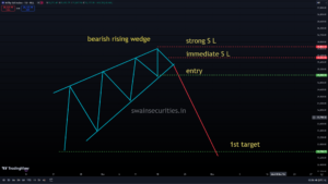
Bearish Rising Wedge
Anatomy of the Pattern
Two converging, upward-sloping trendlines bind the rising wedge: The Lower Support Line: Drawn across a series of progressively higher lows. This line has a steep slope.
The Upper Resistance Line: Drawn across a series of progressively higher highs. Crucially, this line is flatter (less steep) than the lower support line.
Because the support line rises faster than the resistance line, the price waves compress into a progressively narrower corridor. This converging structure proves that even though buyers are managing to clear new highs, they are doing so with less and less enthusiasm on each subsequent swing.
How It Is Traded
Technical traders use the narrowing structure of a rising wedge to prepare for short positions (betting the price will fall) or to exit long positions.
The Entry: Traders wait for a clear, decisive break below the lower support line. A common technique is to wait for a daily or hourly candle to close completely below the trendline to filter out sudden intraday head-fakes.
The Price Target: To gauge the downside potential, traders measure the vertical distance at the widest part of the wedge (where the pattern started). They then subtract that exact height from the specific breakdown point to pinpoint their profit target. Alternatively, the lowest point of the wedge serves as a natural baseline target.
The Stop Loss: To manage risk against a sudden upward reversal, a stop-loss order is placed just above the most recent swing high within the wedge, or slightly above the broken support line.
The Function of Volume Volume plays a vital part in separating a true rising wedge breakdown from a continuation of the rally:
During Formation: Volume should ideally decline steadily as the price wedges higher. Price rising on falling volume is a classic divergence, showing that fewer and fewer market participants are willing to buy at these higher prices.
On Breakdown: The moment the price snaps the lower support line, there should be an immediate spike in trading volume. This surge confirms heavy panic-selling and institutional conviction, validating the bearish move.
14. Bearish Expanding Triangle
A bearish expanding triangle—frequently referred to as a broadening top, bearish megaphone pattern, or expanding wedge—is a highly volatile pattern that warns of a sharp downward turn in price.
Like other broadening formations, it represents a market characterized by pure emotion and chaos. It usually occurs at the peak of a significant uptrend, indicating that the asset is topping out as buyers and sellers battle erratically,
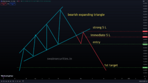
Bearish Expanding Triangle
Anatomy of the Pattern
The bearish expanding triangle is bounded by two diverging lines, giving it the appearance of a megaphone leaning forward: The Ascending Resistance Line: Connecting a series of progressively higher highs.
The Descending Support Line: Connecting a series of progressively lower lows.
To confirm this pattern, you typically want to see at least three distinct peaks and three distinct troughs. The pattern demonstrates a dangerous market cycle: bulls are over-enthusiastic, chasing the asset up to break new local highs, but liquidity immediately thins out, allowing bears to aggressively hammer the price back down to punch out new local lows.
How It Is Traded
Because the pattern gets wider and wider, trading inside the formation carries a massive risk of getting stopped out on erratic swings. Traders look to capture the major move that happens once the chaos resolves.
The Entry: Short-sellers look for a decisive breakout below the lower descending support line. They generally wait for a clear candle close under the support line to ensure the floor has truly given out.
The Price Target: Traders measure the vertical height of the triangle at its widest point (the distance between the final major high and low inside the pattern). They then project that exact distance downward from the breakout point to establish a profit target.
The Stop Loss: Because the pattern’s boundaries are massive, putting a stop-loss above the upper trendline is often too wide for proper risk reward ratios. Instead, traders usually place their stop-loss just above the most recent internal swing high or just back above the newly broken support trendline.
The Role of Volume
Volume trends provide essential confirmation of the underlying market instability:
During Formation: Unlike traditional triangles where volume dries up, volume within a broadening top is usually unstable, chaotic, and high. The market is highly divided and losing its collective composure, as evidenced by the uneven volume. On Breakdown: A significant increase in volume should occur as soon as the price breaks through the lower support line. This surge signals that retail buyers are throwing in the towel and institutional funds are actively shorting, confirming the validity of the bearish breakdown.
15. Bearish Flag Pattern
A bearish flag (or bear flag) is a highly reliable technical chart pattern that signals the continuation of a strong downtrend. It represents a brief pause or period of consolidation after a sharp drop in price, before the sellers take back complete control and drive the asset’s price further down.Because it happens quickly and indicates powerful downward momentum, short-sellers frequently track this pattern to find high-probability entry points.
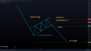
Bearish Flag
Anatomy of the Pattern
The pattern looks like an inverted flag on a pole and is divided into two distinct components:
The Flagpole: This is a sharp, almost vertical drop in price caused by a sudden wave of heavy panic selling or aggressive shorting. It forms the left vertical bound of the pattern.
The Flag: After the vertical drop, the price begins to stall out and bounce. It enters a narrow, slightly upward-sloping consolidation channel. This rectangular “flag” is bound by two parallel trendlines (short-term support and resistance). This bounce isn’t a true recovery; it is simply buyers stepping in to pick up “cheap” shares, mixed with short-sellers taking profits.
How It Is Traded
Because a bear flag is a continuation pattern, traders look to trade it in the direction of the original downward move.
The Entry: Traders wait for the price to break decisively below the lower support line of the flag channel. A clean candle close below this line validates the pattern and signals a short entry.
The Price Target: To measure the profit target, traders take the vertical distance of the original flagpole (from the start of the initial sharp drop down to the lowest point before the flag formed). They then project that exact distance downward from the breakout point on the flag’s lower resistance line.
The Stop Loss: To manage risk if the market suddenly reverses and breaks out upward instead, traders place a stop-loss order just above the upper resistance line of the flag channel.
The Role of Volume
Volume offers critical clues about whether the flag is legitimate or failing:
During the Flagpole: Volume should be very high during the initial plunge, indicating aggressive institutional sell-side pressure.
During the Flag: Volume should dry up significantly as the price drifts upward within the parallel lines. Low volume during the bounce proves that the upward move lacks conviction and that buyers are weak.
On the Breakdown: A surge or spike in volume should reappear the moment the price snaps below the flag’s support line, validating that a new wave of heavy selling has commenced.
16. Descending Triangle Pattern
In technical analysis, a common chart pattern is the descending triangle. It is primarily regarded as a bearish continuation pattern, which means that it typically appears during an established downtrend and paves the way for a further price drop. Occasionally, it can form at the top of an uptrend as a bearish reversal pattern, but its structural implication remains the same: a breakdown is expected.
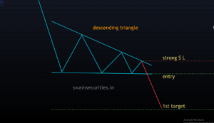
descending triangle chart pattern
Anatomy of the Pattern
The descending triangle is created by the price consolidating between two distinct trendlines:
The Flat Lower Support Line: A horizontal line drawn across a series of lows that bottom out at roughly the same level. This level represents a strong demand zone where buyers temporarily step in to absorb the selling pressure.
A downward-sloping line connecting a series of progressively lower highs is the Descending Upper Resistance Line. This reveals that sellers are becoming more aggressive, willing to sell at lower and lower prices on every single bounce.
As the price bounces between these boundaries, the trading range narrows significantly into the apex of the triangle. This structure indicates that the sellers are steadily overwhelming the buyers while the buyers maintain a firm defensive floor. How It Is Exchanged Short-sellers look to leverage the breakdown of a descending triangle to catch a swift downward move.
The Entry: Traders wait for a decisive breakdown below the flat horizontal support line. To avoid false breakdowns, many look for a candle to close completely below the support line on a high-volume time frame (like the 4-hour or daily chart).
The Price Target: To establish a profit target, measure the vertical distance at the widest part of the triangle (from the first peak high down to the horizontal support line). Project that exact vertical distance downward from the breakdown point.
The Stop Loss: To protect against a failed breakdown where the price suddenly reverses back inside the pattern, a stop-loss order is commonly placed just above the descending resistance trendline or above the most recent minor swing high within the triangle.
The Role of Volume
Volume offers key validation for a descending triangle setup:
During Formation: Trading volume should steadily dry up as the price action gets squeezed closer toward the apex. This reflects a temporary decline in participation as the market waits for a definitive move.
On the Breakdown: The exact moment the flat support floor cracks, there should be an immediate and massive spike in volume. High volume confirms that institutional sellers have aggressively cracked the floor, lending strong validity to the bearish breakdown.
17. Bearish Pennant Pattern
A bearish pennant is a short-term technical chart pattern that signals the continuation of a strong downtrend. Like the bearish flag, it marks a brief pause where the market consolidates and catches its breath before sellers aggressively force the price down to resume the prevailing trend.
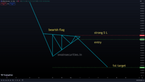
Bearish pennant
Anatomy of the Pattern
A bearish pennant is easily identified by two structural components:
The Flagpole: A sharp, rapid, and near-vertical drop in price. This indicates a significant amount of institutional shorting or panic selling. The Pennant: Following the fall, the price stops moving and begins to bounce within a narrow range. Two convergent trendlines form a small, symmetrical triangle around this consolidation: An ascending support line drawn across higher lows.
A descending resistance line drawn across lower highs.
While a bear flag moves upward in a parallel rectangular channel, a bear pennant compresses inward until its trading range almost completely chokes out near an apex.
How It Is Traded
Traded strictly as a continuation setup, traders look to catch the next leg of the downward trend.
The Entry: Traders watch for a sharp breakdown below the lower ascending support trendline of the pennant. Short positions are typically triggered on a clean candlestick close outside the pattern.
The Price Target: To calculate a profit target, measure the vertical distance of the initial flagpole (from the absolute top of the initial drop to the bottom where the pennant first started to form). From the breakdown point on the lower trendline of the pennant, project that exact vertical length downward. The Stop Loss: To minimize risk if the breakdown fails and the price whipsaws upward, a stop-loss order is placed safely above the upper descending resistance line of the pennant structure.
The Role of Volume
Volume dynamics act as a critical health check for the validity of a bearish pennant:
During the Flagpole: Volume should be exceptionally high, showing intense and broad conviction behind the initial price sell-off.
During the Pennant: Volume should dry up dramatically as the price action gets squeezed into the apex. This shrinking volume indicates that the minor upward movement isn’t backed by true buyers; it is simply a temporary pause.
On the Breakdown: The moment the lower support line cracks, volume must spike sharply once again, confirming that sellers have re-entered the market in full force.
18. Tripple Top
A triple top is a classic bearish reversal chart pattern. It occurs at the height of a long-term uptrend and is a strong indicator that buyers are losing control of the market, preparing the way for a significant trend reversal to the downside. It represents a prolonged battle where the price tries—and fails—three separate times to break past a specific ceiling of resistance.
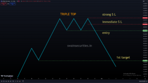
Tripple top
Anatomy of the Pattern
There are three distinct parts to the triple top pattern: Three Peaks: The price rallies up to a high point (Peak 1), faces resistance, and pulls back. It rallies again to roughly the same high level (Peak 2) before dropping back down. Finally, it makes one last attempt to clear that level (Peak 3) and fails again. These three peaks should top out at approximately the same price level.
The Neckline—also known as the Support Line—is a horizontal support line that runs across the lowest points of the pullbacks—also known as troughs—that are situated in between the three peaks. This represents the defensive floor that buyers are protecting.
The Reversal: The pattern is only fully confirmed when the price fails at the third peak and drops all the way down to slice through the neckline.
How It Is Traded
Technical traders use the distinct levels of the triple top to carefully manage risk and structure short positions (betting the price will drop).
The Entry: Traders wait for the price to break decisively below the horizontal neckline. Jumping into a short trade before the neckline officially breaks is risky, as the asset could simply continue consolidating or bounce back upward.
The Price Target: Measure the distance vertically from the top resistance line (the peaks) to the horizontal neckline to set a profit target. Project that exact same distance downward from the breakout point on the neckline.
The Stop Loss: To protect against a false breakdown, a stop-loss order is commonly placed just above the neckline or above the most recent peak (Peak 3) inside the pattern.
The Role of Volume
Volume dynamics act as an invaluable confirmation tool during the development of a triple top:
During Formation: Volume often decreases with each successive peak. Peak 1 usually sees the highest volume, Peak 2 shows slightly less, and Peak 3 shows even less buying enthusiasm. This classic trend shows that the buyers are steadily running out of gas.
On the Breakdown: The exact moment the price cracks below the neckline support floor, there should be an immediate surge in volume. This sudden spike indicates heavy institutional selling and panic, validating the bearish trend reversal.









Leave a Reply